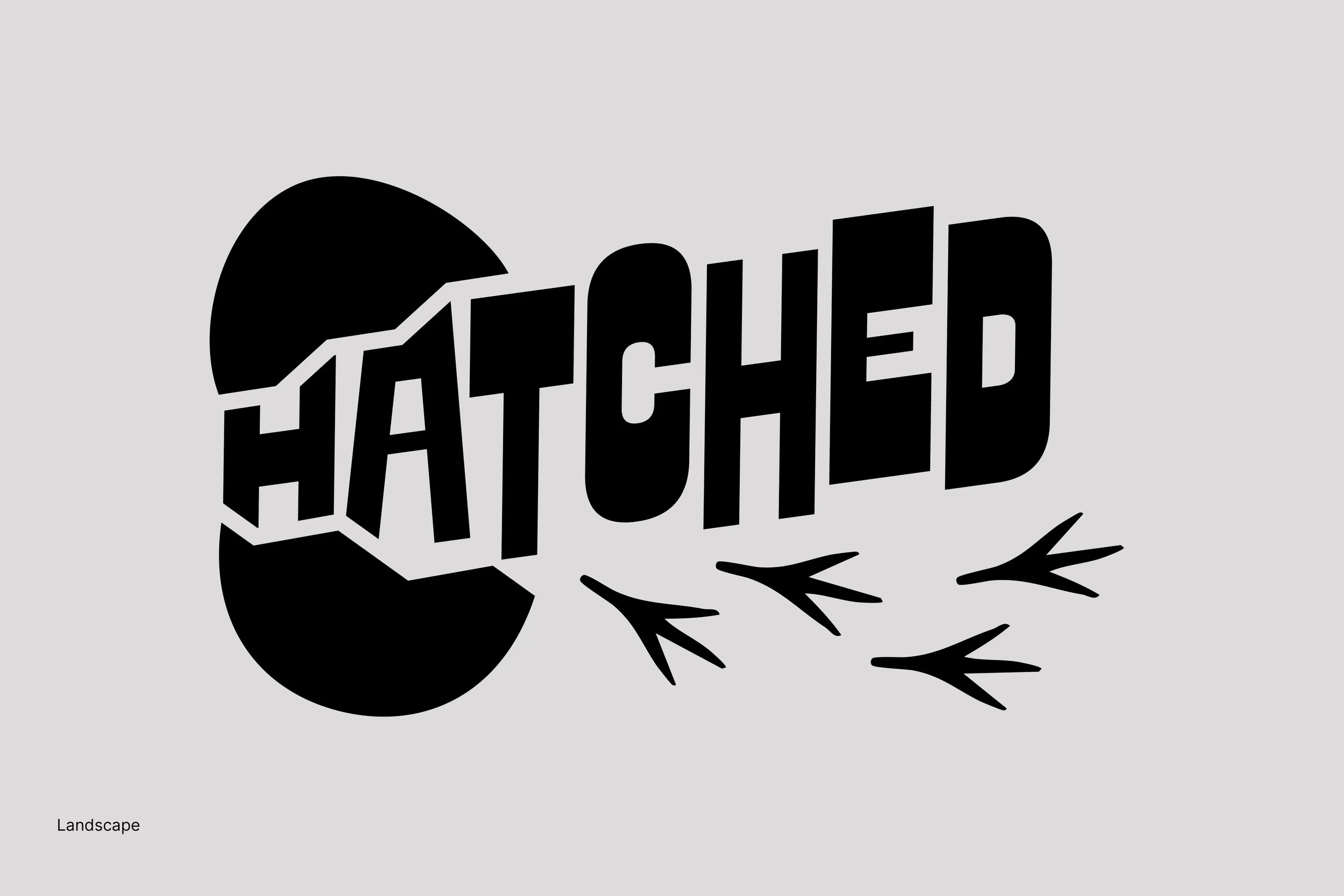
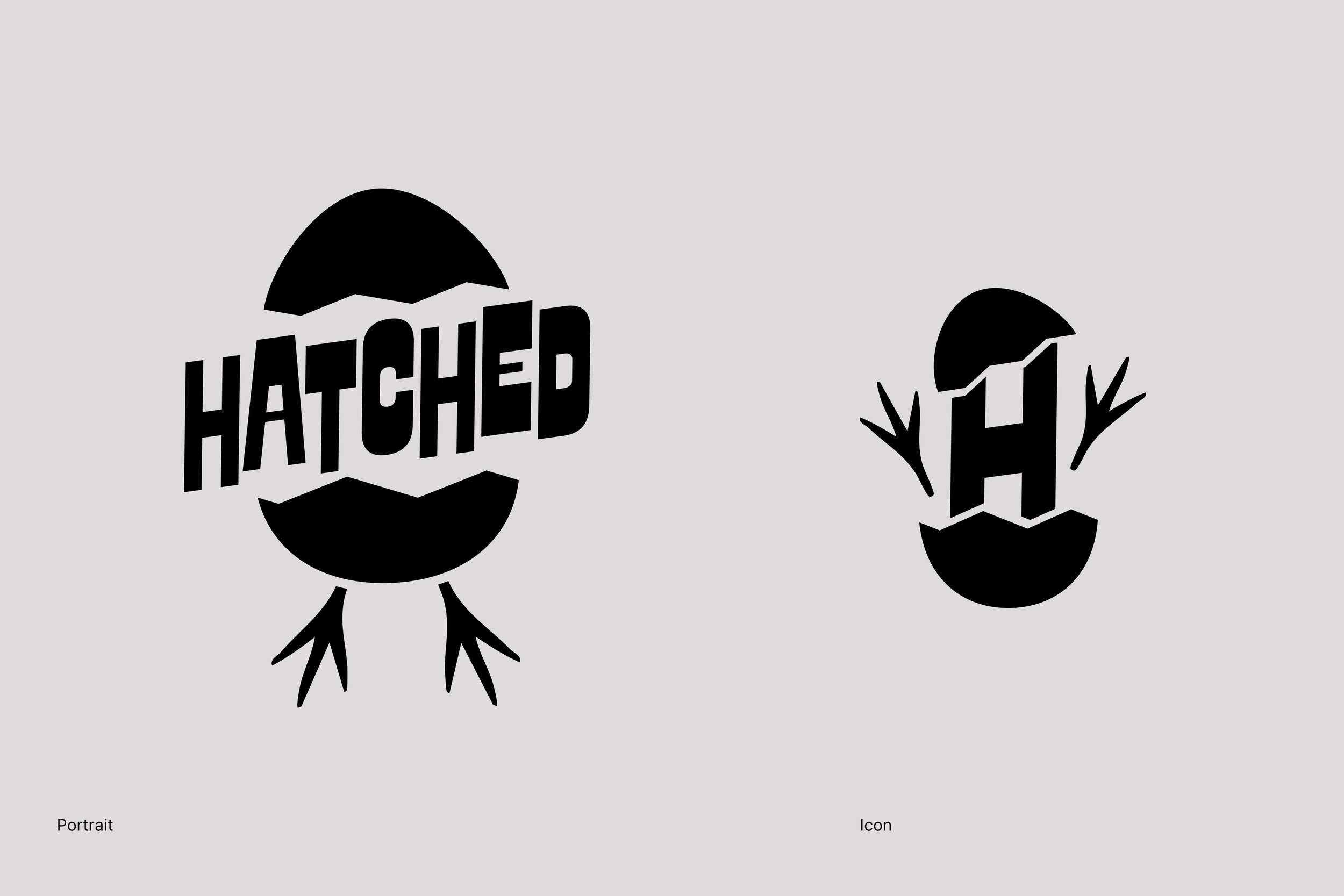
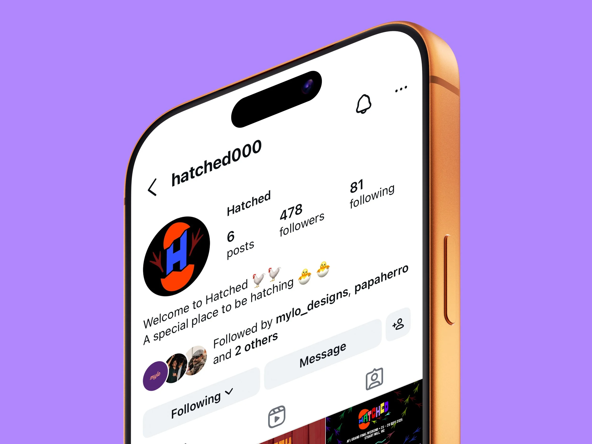
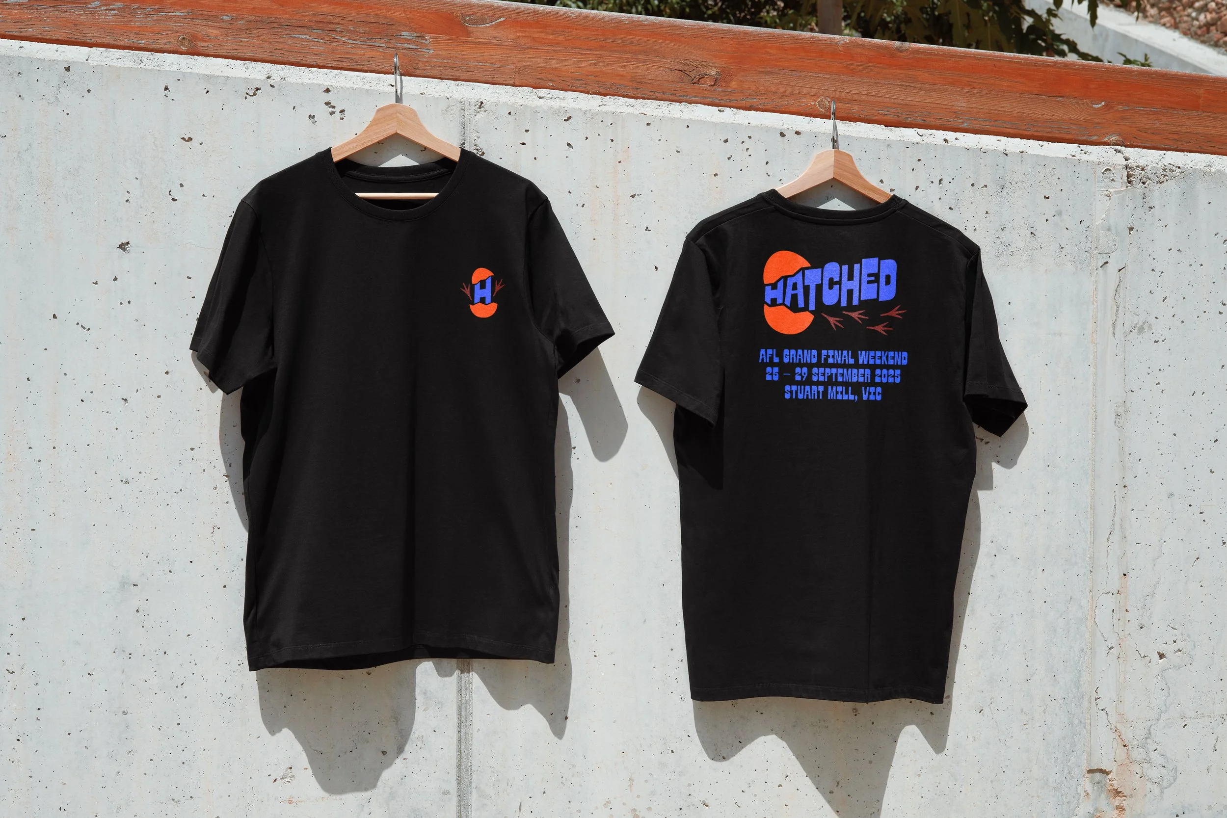
Hatched
IDENTITY | BRANDING | CONCEPT
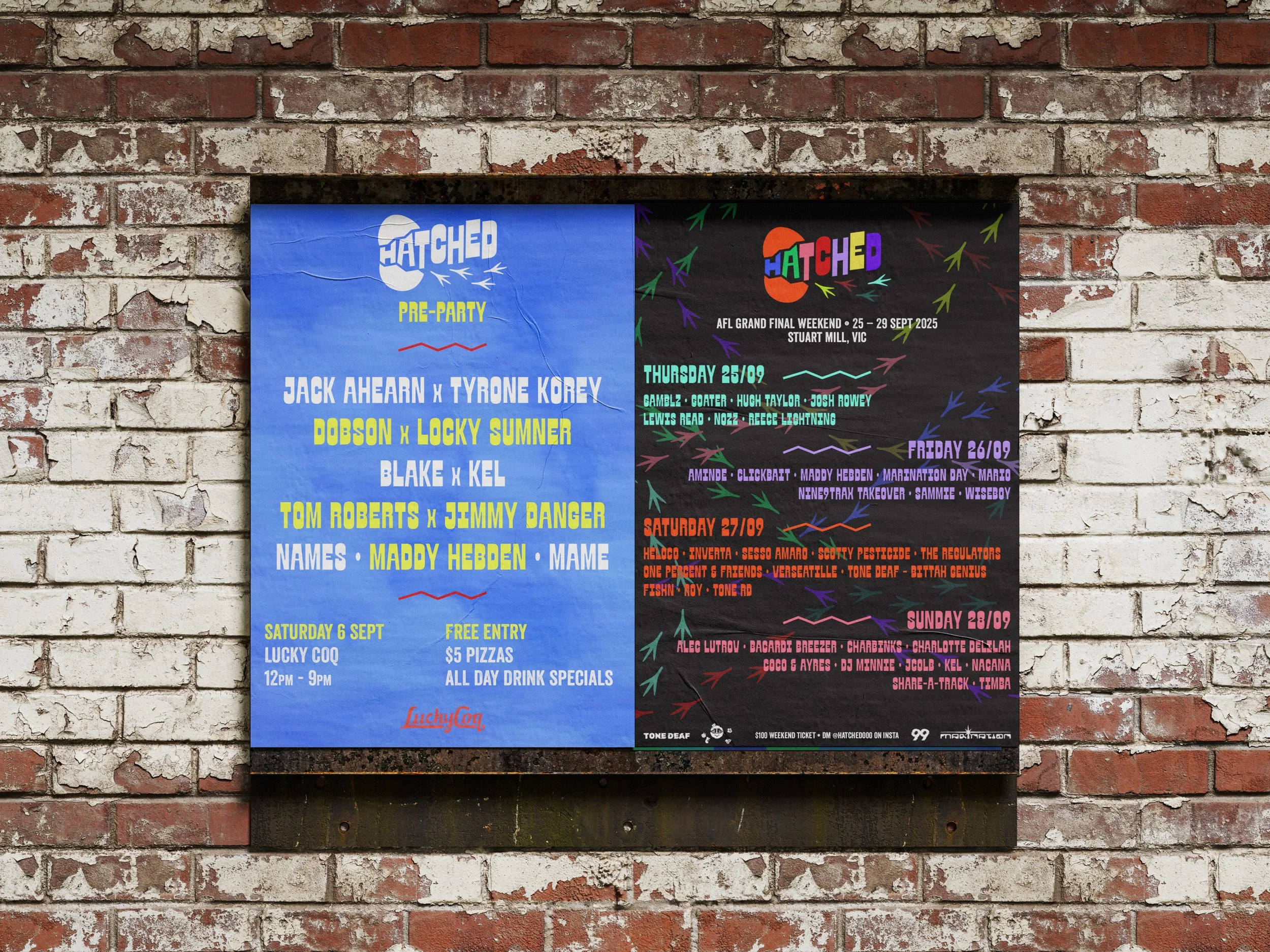
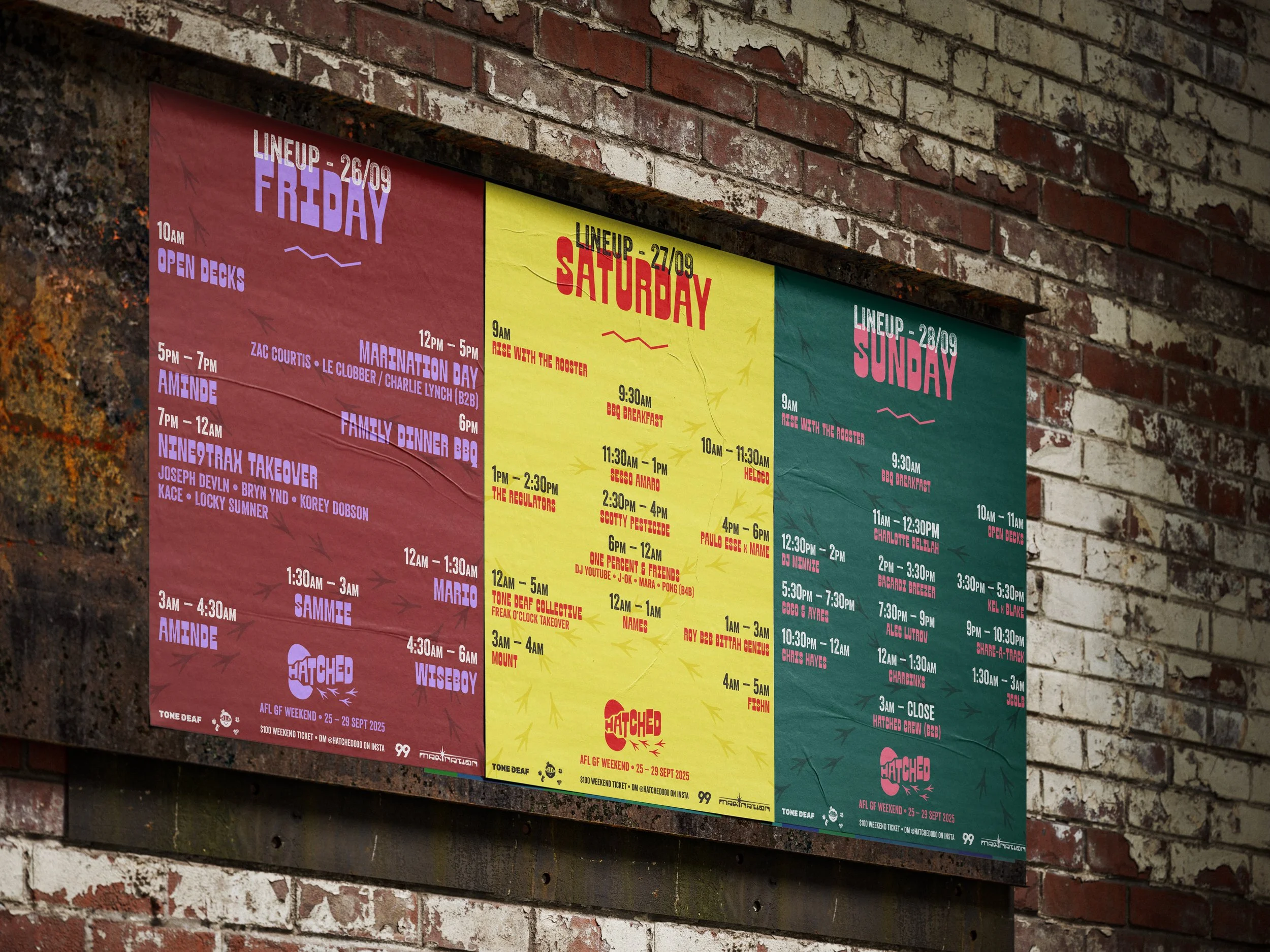
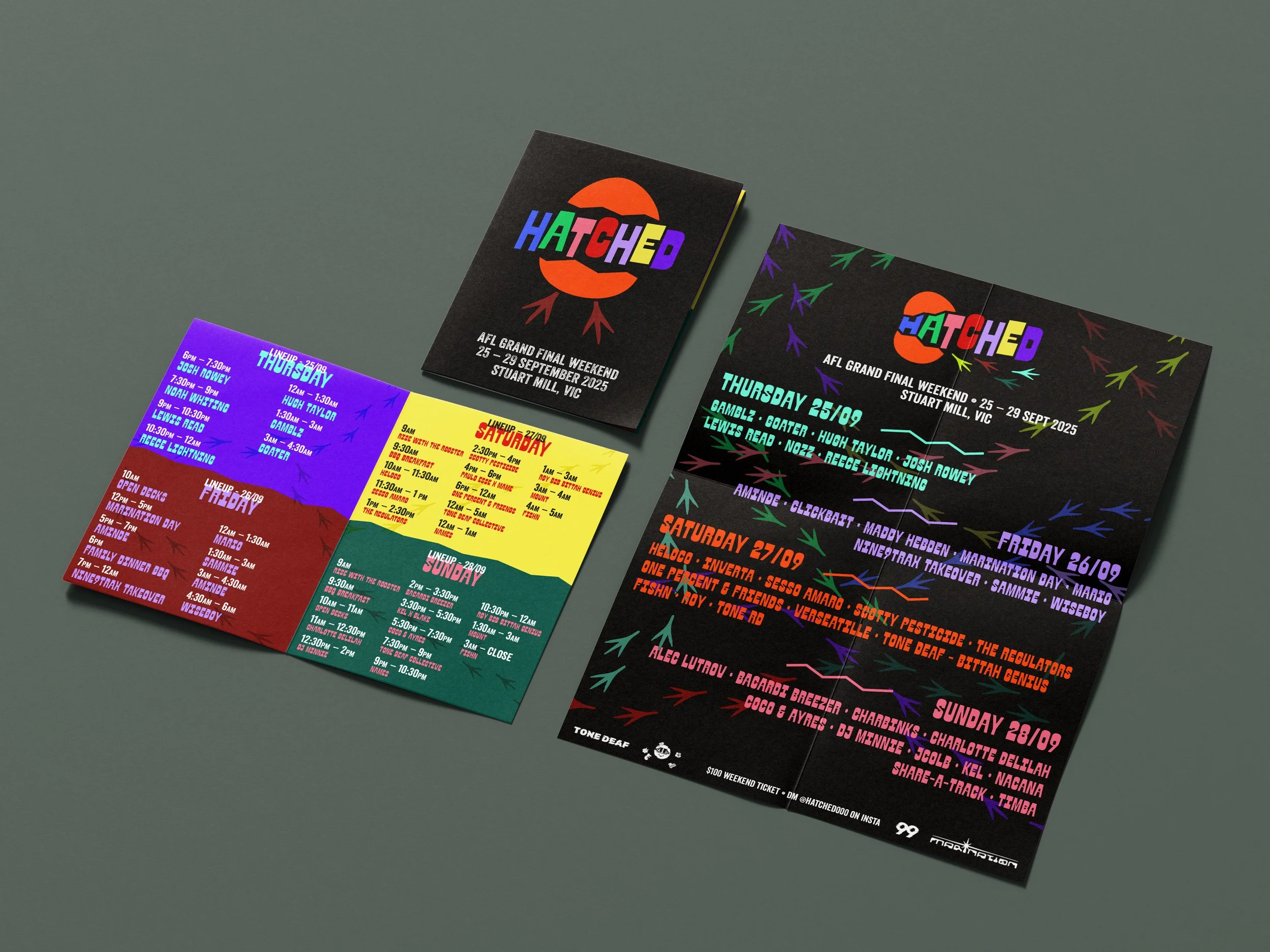
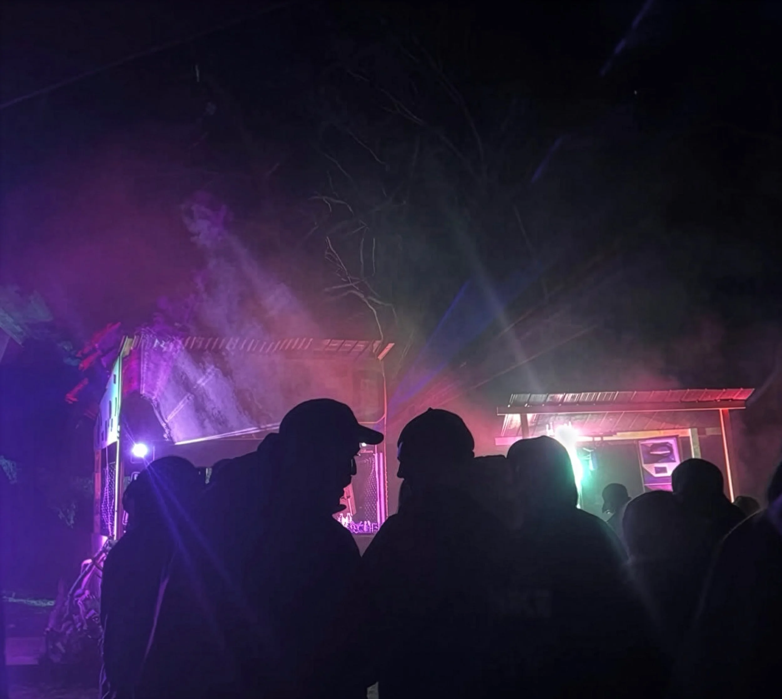
Hatched is a small-scale electronic DIY music festival, known as a ‘Bush Doof’, located in rural parts of Melbourne, Australia.
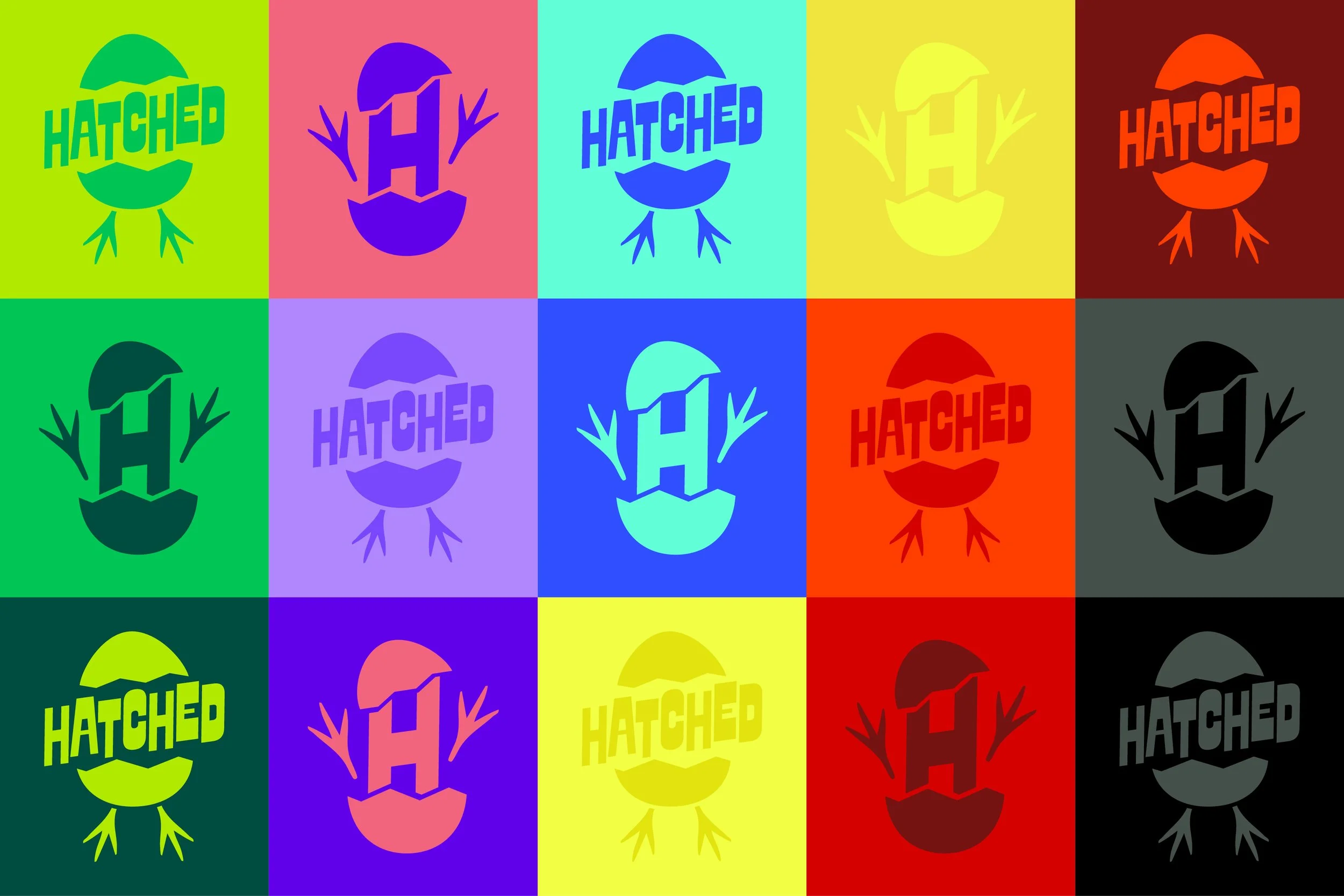
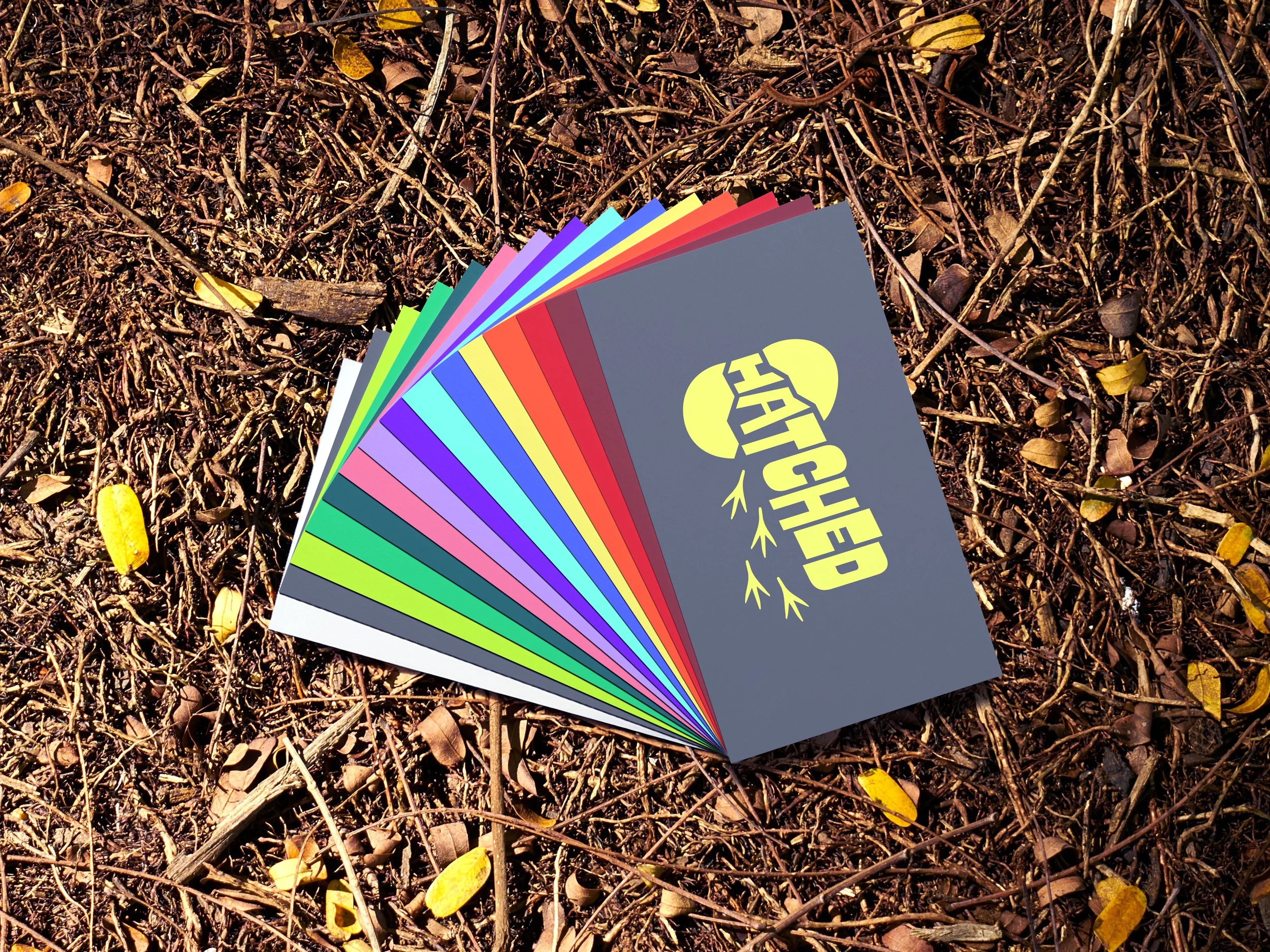
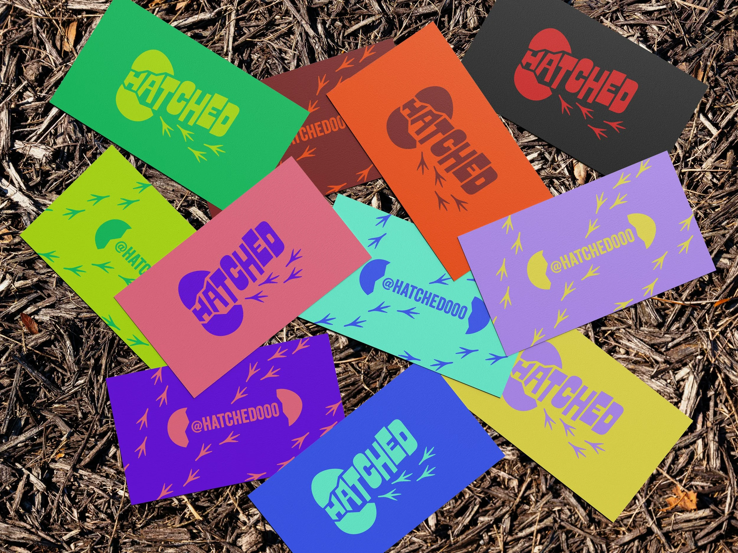
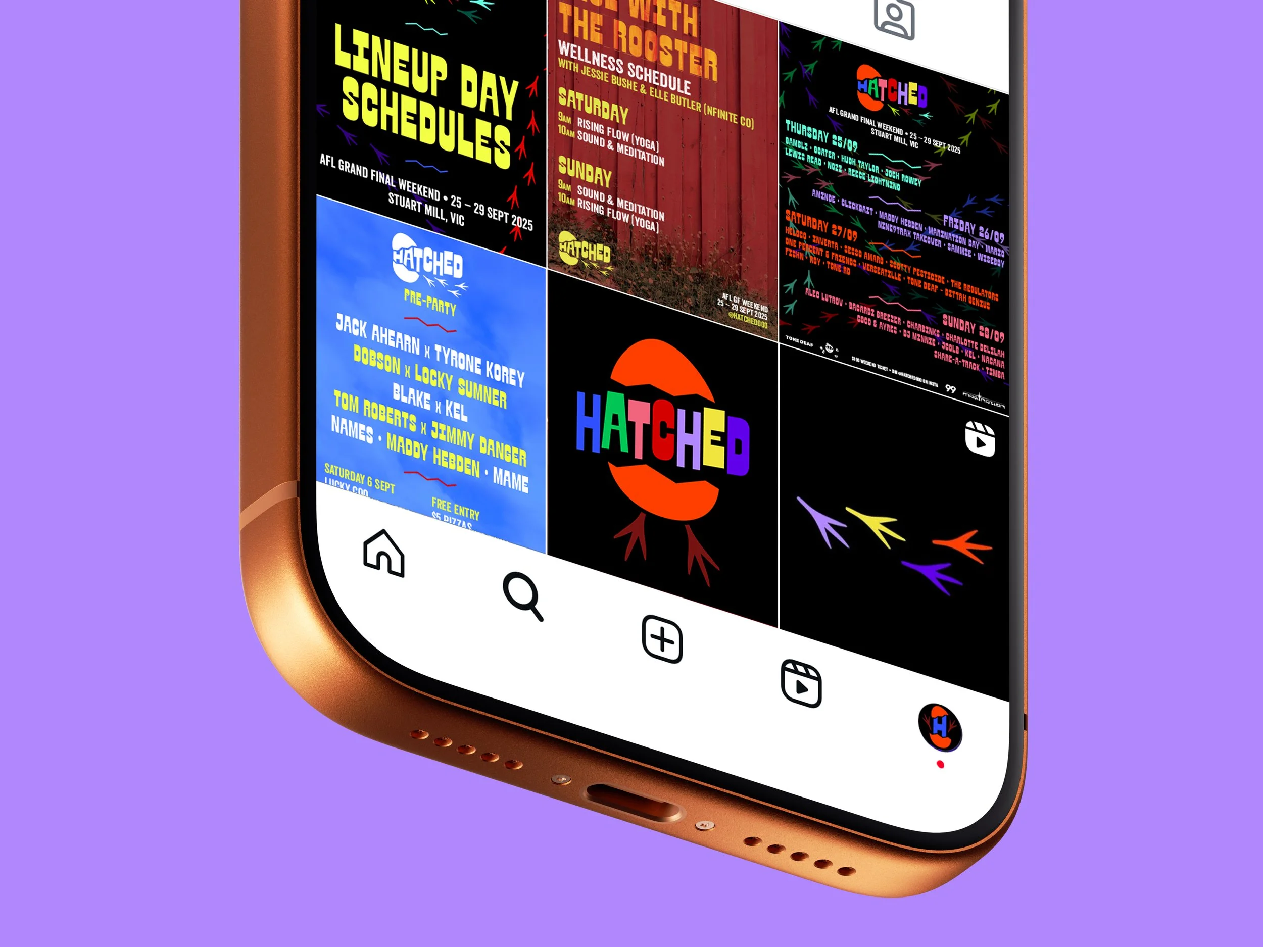
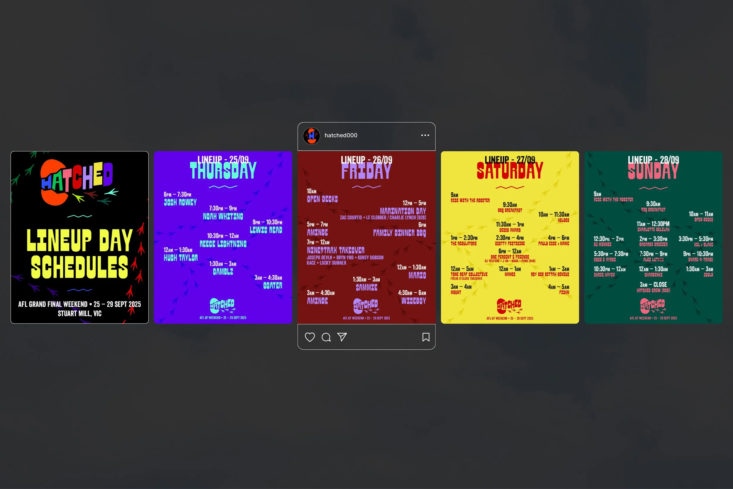
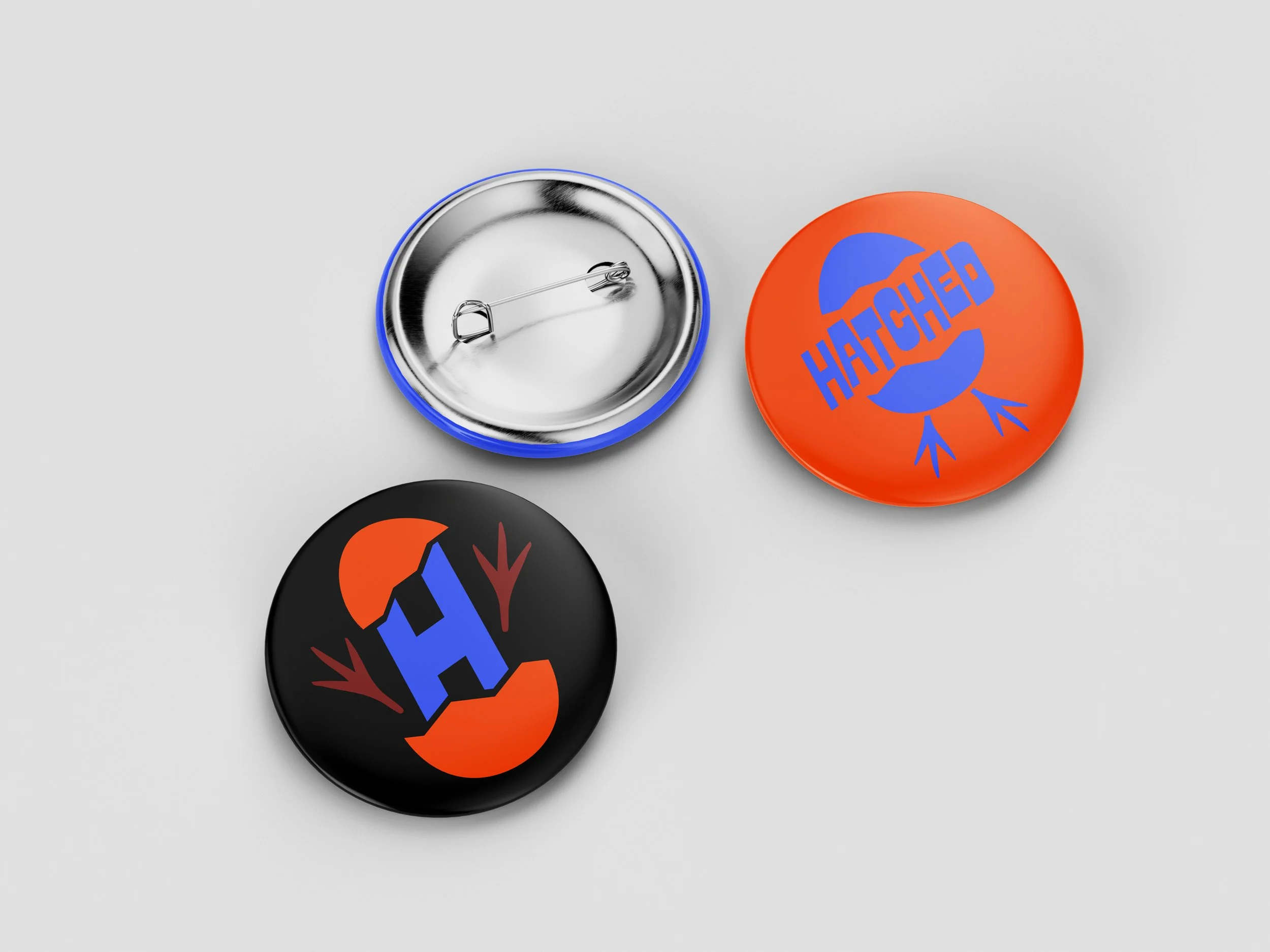
Following on from their previous events, I was approached to produce a refreshed visual identity for their latest iteration. The logo and overall theme is directly visualised from the name itself – using imagery of cracked eggs and chicken feet.
It’s an evolution of what was already in place, but more streamlined and honed in on the theme. It lends itself to the low-fi, homemade nature of the festival; where local DJs come together to put on a party in the woods for the weekend.